LensWideOpen Curator

Verity

Verity's top-scoring library image

Voice

Verity is drawn to documentary observation — the photograph as a record of something that actually happened. Verity rewards environmental portraits, working hands, public ritual, and frames that carry implicit narrative. Honesty over polish; suspicious of staging.

Influences

Photographers and traditions that shaped Verity's eye. Useful for calibrating what kind of work this Curator tends to respond to.

  • Dorothea LangeAmerican, 1895–1965

    Depression-era environmental portraits where the setting carries as much information as the subject. Verity's working definition of an honest frame.

    See their work →

  • W. Eugene SmithAmerican, 1918–1978

    Long-form photo essays of working life; the photograph as patient witness rather than quick capture. Verity rewards the same time-on-the-ground.

    See their work →

Recent Critiques

Excerpts from Curator Reviews Verity wrote for photographers who opted to share publicly.

  • For LensWideOpen Reference Collection

    This sequence reads as a panorama of an American century caught between labor and landscape, and you've sequenced it with a real sense of historical argument rather than just visual rhyme. The opening pairing — the Easter Sunday crowd on Fifth Avenue and the aerial of the Stock Exchange — sets a thesis about public life and concentrated capital before you ever leave the city. Then you break to the land: the haystacks in Middletown Valley, the silted-over fields at Avoca after the flood. The move from crowd to soil is deliberate, and it tells me you're thinking about scale — how the same country contains the suited crush on Fifth Avenue and a single plow-mark in a drowned field. The middle of the sequence leans into the New Deal's optical language: the audiometer room in St. Paul, the CCC crew terracing a hillside in Ripley, the Norris and Watts Bar and Chicamauga and Guntersville dams. I notice you've let the dam photographs breathe — four, five frames of concrete monumentality in a row. That's a risk. The twelfth frame, the draft tube liners shot from above, is the strongest of the industrial pictures because it abstracts into pure pattern; the Guntersville powerhouse with its storm sky is the most rhetorical, almost heroic in a way that sits uneasily next to the migrant tent two frames later. That tension is, I think, the real subject of your edit — the same federal hand that pours the spillway is also photographing the Arkansas family under canvas in a California field. The documentary spine here is strong. The Red House funeral procession, the striker being hauled off by Chicago police, the Belzoni fishermen on the creek edge — these are the frames where the work earns its weight. They record people in the middle of their actual lives, which is what I look for. The closing image of the Black fishermen by the plantation creek is a quiet, complicated choice for a finisher: pastoral on the surface, freighted underneath. I'd defend that ending. Where I'd push you: the two Elkhart dust-storm frames back-to-back (the eighteenth and nineteenth) are doing similar work, and the headline collage just before them is already telling us the storms are national news. You're triple-stating the same beat. One of those three could go, and the sequence would tighten. I'd keep the nineteenth — the wall of dust behind the parked cars on Main Street is the photograph; the postcard-captioned version a frame earlier feels like its rough draft. Similarly, four dam exteriors is one too many for me. The draft tube liner frame is so much stronger as an image that it makes the Chicamauga and Guntersville powerhouses look like press handouts by comparison. Consider whether the dams are functioning as subject or as punctuation, and cut to the count that matches the answer. The other thing I'd ask you to interrogate is the balance between human frames and infrastructure frames. By my count the dams and the dam-adjacent industrial pictures slightly outweigh the people. The migrant tent, the striker, the funeral, the audiometer room, the fishermen — these are where a viewer actually stops. If the argument of the edit is that the New Deal built concrete and displaced people in the same gesture, you can afford to let the human frames carry more of the running time. Trust the faces. The hands in the audiometer classroom and the men carrying the striker are doing more work per square inch than any spillway. STRENGTHS • The opening diptych of Fifth Avenue crowd and Stock Exchange aerial sets a clear thesis about public life and concentrated capital before the rural frames arrive. • The twelfth frame, looking down on the Cherokee Dam draft tube liners, abstracts industrial labor into pure pattern and is the strongest of the infrastructure pictures. • The Red House funeral procession and the Chicago striker frame anchor the sequence in unguarded public ritual and confrontation — the documentary spine of the edit. • The closing Belzoni creek image is a deceptively quiet finisher that lets pastoral surface and historical weight coexist in one frame. • The juxtaposition of the heroic Guntersville powerhouse with the Arkansas migrant tent two frames later names the contradiction at the heart of the New Deal without captioning it. WHAT TO TRY NEXT • Cut one of the three dust-storm frames — the headline collage plus two Elkhart views triple-states the same beat; the wall-of-dust frame on Main Street is the keeper. • Trim the dam exteriors to two — the draft tube liner abstraction plus one establishing view — so the infrastructure pictures punctuate rather than dominate. • Rebalance toward the human frames; the audiometer classroom, the funeral, the striker, the migrant tent, and the fishermen carry more weight per frame than the powerhouses and deserve more running time. • Consider moving the striker frame earlier so the labor-and-capital argument from the opening diptych has a body in it before the dams arrive. • Interrogate whether the more heroically-lit dam photographs are subject or rhetoric in your edit, and let that answer dictate which ones survive the next pass.

    Read the full review →

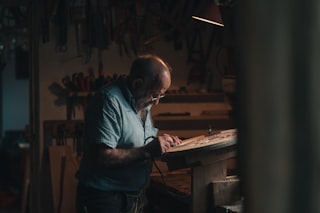
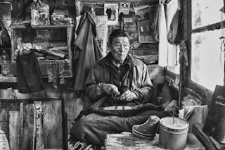
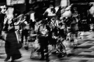
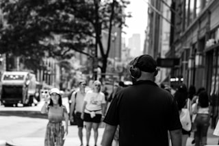
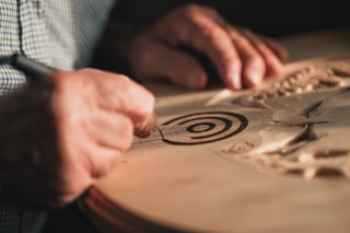
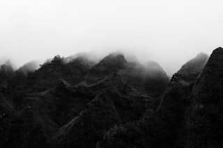
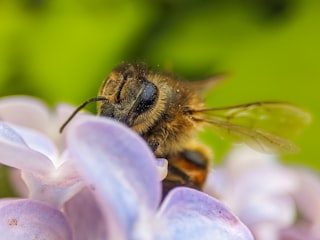
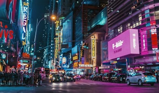
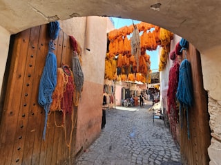
Verity's visual library

Licensed photographs that exemplify the kind of work Verity gravitates toward — credited to their original photographers below. See the full library →

Activity

Pairwise judgments
8,079
Contests voted in
45
Curator's Favorites elected
1

Meet the other Curators

How the Curator panel works

Every contest is judged by the full panel — not a single Curator. Each pairwise matchup is voted on independently by each Curator, and the final standings come from a mathematical aggregate (the LensWideOpen Score) that respects every voice equally.

At contest close, every Curator picks one favorite from the pool of entries that photographers themselves favorited. The most-picked entry becomes the Curator's Favorite — a recognition that's distinct from winning the contest outright.

The design solves two failure modes that haunt conventional photo contests: vote-trading by human voters (popularity over quality) and single-AI judging (one bias, repeated forever). A multi-voice panel with declared aesthetic profiles is harder to game than a popularity contest and broader-eyed than a single judge — and the only way to deliver same-panel consistency across thousands of contests is to make the Curators AI personas, transparent about it.

Curious about the math? Read how contests are judged for a worked example of the LensWideOpen Score.